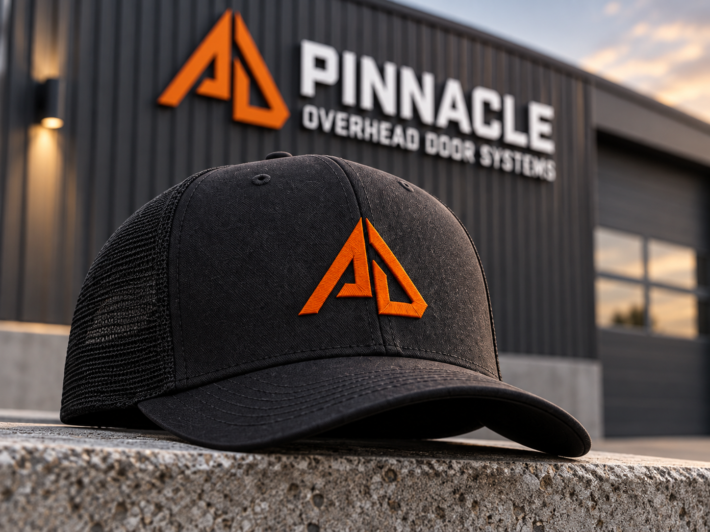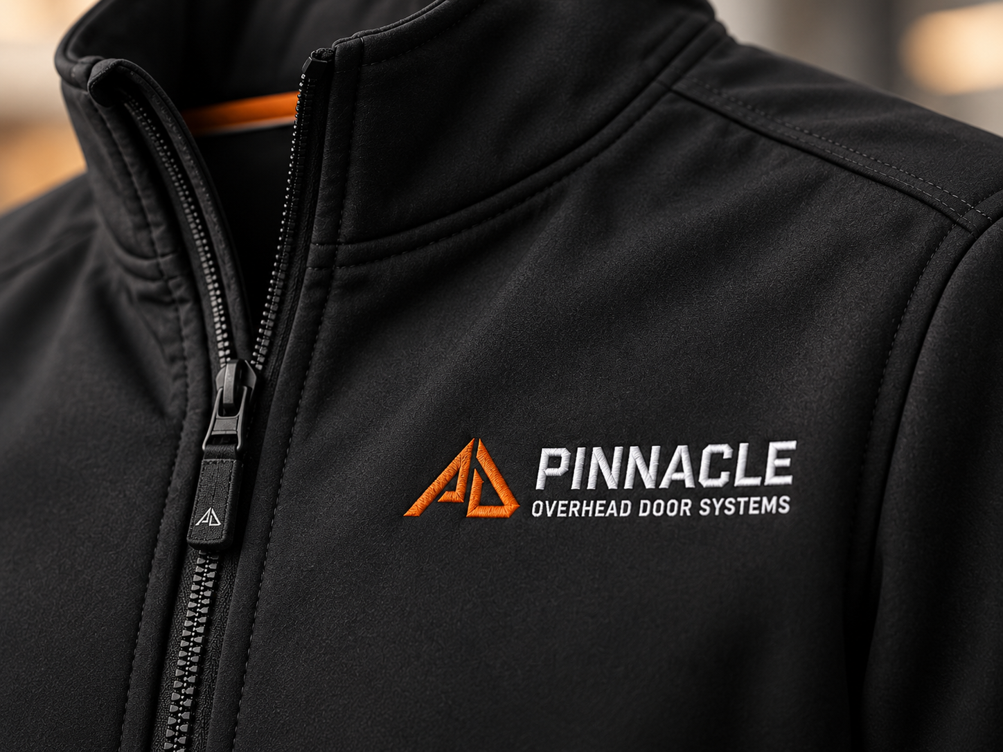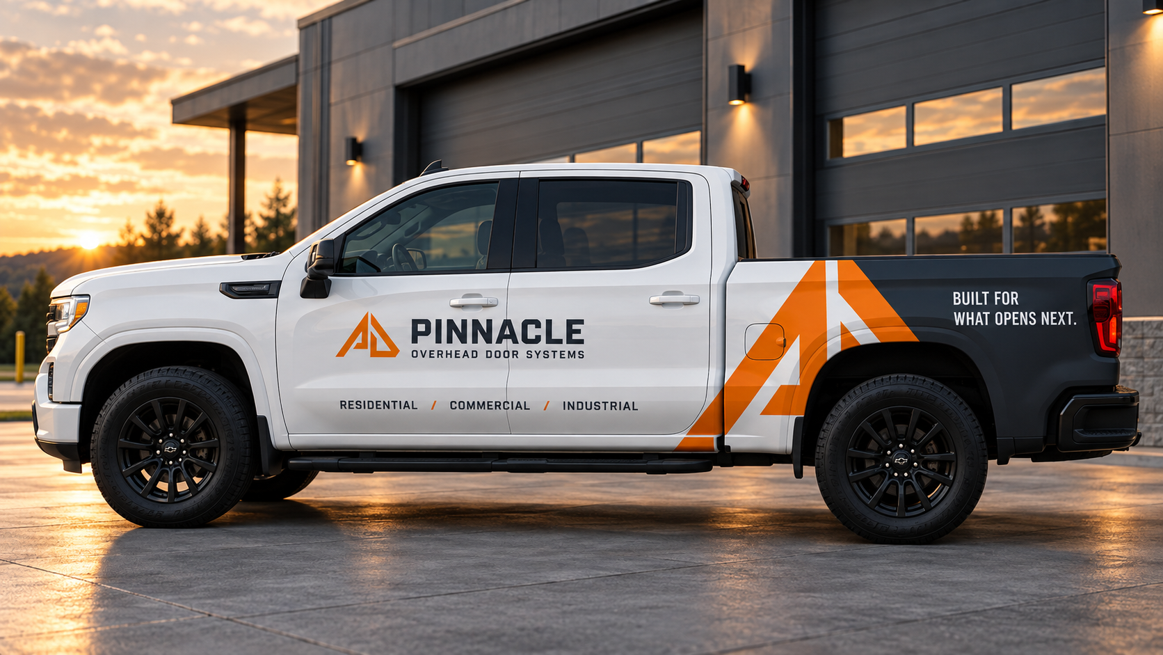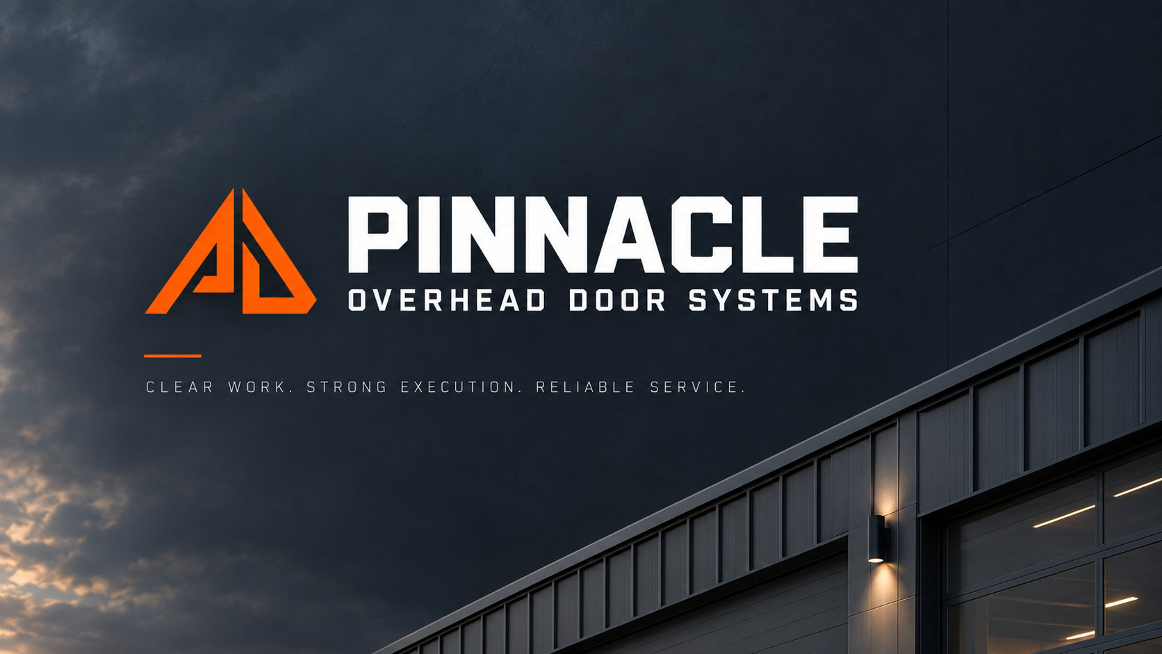
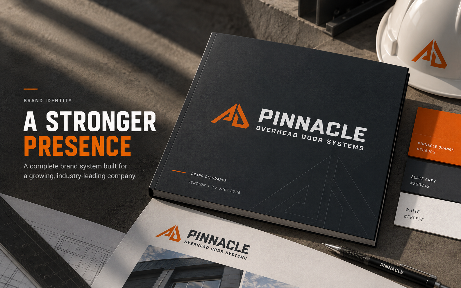
Pinnacle needed a brand that could communicate trade-grade capability with a sharper, more modern presence.
A practical identity system
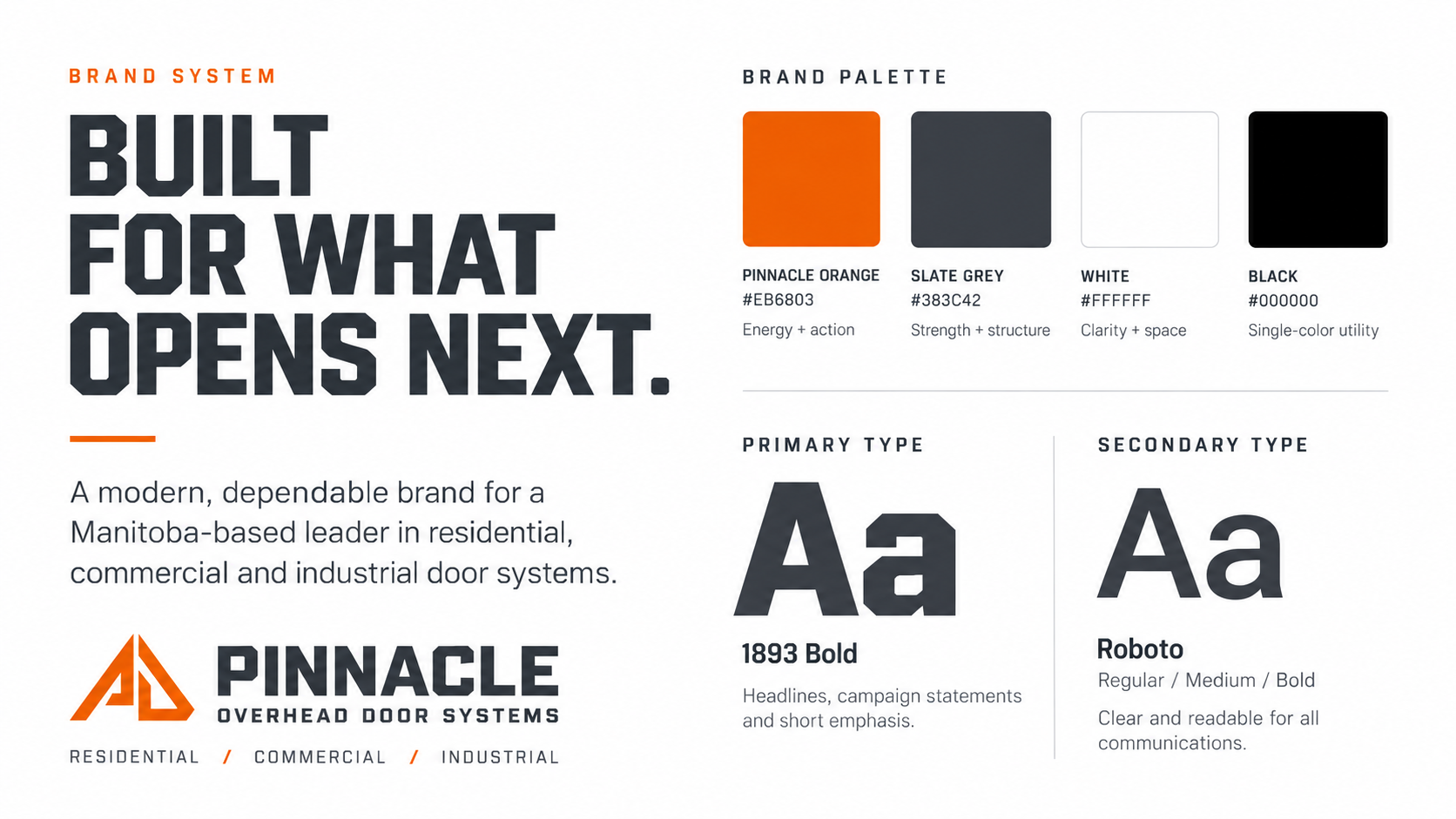
The work includes a primary horizontal logo, a stacked version for tighter spaces, and an icon mark for small digital applications. The standards guide sets the rules for clear space, minimum size, colour, typography, and production use.
Ready for the work itself
The system is designed to hold together across the website, vehicles, workwear, facility signage, documents, and future sales materials. Orange acts as a controlled signal against Slate Grey, white, and black.